Pantone’s Color of the Year 2026 is “Cloud Dancer” (11-4201) — a calm, weightless shade of white that stands for mindfulness, clarity, and a fresh start.
For the first time ever, Pantone has highlighted a white as the color of the year, and it speaks volumes about where global design is heading.
As digital creators, web designers and product-driven brands, this neutral shade offers more than aesthetics — it represents a new way users want to experience products: quiet, focused, minimal, and intentional.
Why 2026 Belongs to Calm, Clean and Minimal Design
“Cloud Dancer” reflects the world’s shift toward:
- Minimalism over noise
- Comfort over complexity
- Clarity over distraction
Consumers are tired of overstimulation — cluttered feeds, loud advertising, overloaded interfaces.
The demand now is for calm visuals, spacious layouts, and quieter communication. White is no longer “empty space.” It’s breathing room.
Cloud Dancer & UX Design — A Perfect Pair
In digital experiences, white tones like Cloud Dancer help users:
- Focus on content without visual fatigue
- Read comfortably across devices
- Experience clarity and simplicity
- Trust the brand through clean visuals
Practical UI/UX Use Cases
| Usage | Result |
|---|---|
| Background color for clean layouts | Focused reading + premium feel |
| Minimal landing pages with bold typography | Better conversions |
| Product pages with subtle shadows | Increased attention on products |
| Neutral branding tone with accent colors | Timeless identity |
| Calm onboarding & dashboards | Higher user retention |
Color Psychology: Why White Works for Modern Brands
White or neutral tones signal:
- Trust
- Fresh beginnings
- Luxury & sophistication
- Clean technology
- Clarity of ideas
That’s why leading tech and lifestyle brands embrace minimalist palettes — it strengthens their credibility and instantly elevates the product.
Who Should Use Cloud Dancer in 2026?
🌐 Tech & SaaS Brands: For premium UI dashboards
🛍️ D2C & Fashion eCommerce: For aesthetic product focus
🏢 Corporate & Consulting Brands: For trust-centric branding
📱 App & Startup UX: For clean onboarding and higher conversion
🎨 Creative Agencies: Minimalist identity = creative leadership
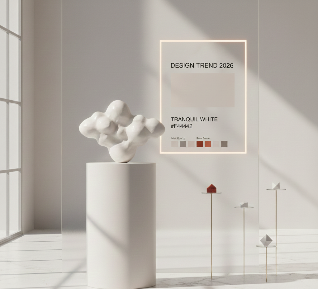
Cloud Dancer Palette Ideas for Digital & Web Design
| Type | Color | HEX |
|---|---|---|
| Primary Neutral | Cloud Dancer White | #F4F4F2 |
| Accent 1 (Calm Grey) | Mist Quartz | #B5B3AE |
| Accent 2 (Soft Black Matte) | Night Veil | #1B1B1A |
| Highlight Pop (Muted Red) | Rose Ember | #C3424F |
| Luxury Gold Accent | Warm Alloy | #C99D66 |
Use Rose Ember for CTA buttons & Warm Alloy for premium highlights.
UX Tip: Respect White Space
White space isn’t empty — it tells the eyes where to go.
Combine Cloud Dancer backgrounds with:
- Large typographic headings
- Reduced color density
- Balanced content sections
- Icon-driven information
This instantly creates luxury, trust and readability.
Final Thoughts: Cloud Dancer Defines a New Digital Language
Cloud Dancer isn’t a trend color — it’s a symbol of shift.
In 2026, design is moving away from noise. Users crave clarity, comfort, and calm in the products they interact with.
For brands, startups and UX designers, adopting this aesthetic isn’t just style — it’s strategy.
Clean, calm, conversion-driven design wins.
Wow, this piece of writing is good, my sister is analyzing these kinds of things, thus I am going to convey her.